Every brand has a story, and a logo is a way of encapsulating that story in a design that represents the brand at a glance.

Though you can get a logo designed quickly and cheaply, it’s usually not a good idea to do so. Logos tend to stick with a brand over the long term, with small changes or updates along the way. It’s worth taking time and working with a designer who has a strong track record of designing logos.
Having a great logo for your brand is powerful. Colored designs are associated with an 80% increase in brand recognition. Combine that with the fact that the vast majority of purchasing judgments are based on visual perceptions, and it’s clear why a great logo is a valuable brand asset.
Here’s how different colors, shapes, and typefaces affect psychological perception when designing or upgrading your logo. Understanding these psychological effects can help you create a logo that is the perfect adjunct to your brand story.
Color Use in Logo Design
Color associations are often rooted in culture, and though there are no hard and fast rules, certain colors tend to convey certain feelings. In Western culture, the following color and feeling associations are widely accepted:
- Black – tradition, authority, sophistication. Black in a logo can convey that you “mean business,” or that you offer elegance and sophistication.
- Purple – creativity and imagination. Purple is playful, but not in an infantile way.
- Blue – security, strength, calm, dependability. It’s no accident that many industries where trust is paramount (like healthcare and investing) use shades of blue in their logos.
- Green – peace, freshness, earthiness. Many organic and “earth-friendly” brands rely on shades of green because of its ties to nature.
- Yellow – optimism and confidence. Yellow catches the eye, and its boldness conveys that the brand isn’t shy.
- Orange – friendliness and cheerfulness. Orange is a fun color, often associated with brands that are considered “entertaining.”
- Red – excitement, dynamism, and boldness. Red is also often associated with hunger, which is why many restaurants use it in their logo designs.
Shapes in Logo Design
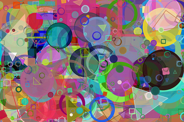
Geometric shapes underly many logo designs. The simplicity of geometric shapes offers great scope for customization while working well with surfaces which logos are used, such as on brand packaging. Here’s how two types of logo shape tend to come across:
- Circles and ovals – positive emotions, community, friendship, unity. Curved shapes of any type tend to have a more feminine connotation.
- Squares and triangles – stability, balance, strength. Straight-edged shapes with identical angles tend to be viewed as more masculine.
Of course, these tendencies are just that. Rounded logos can be designed to convey strength and masculinity. Likewise, angled shapes can be successfully used in products that are more feminine. Colors and typefaces can greatly influence how various shapes are perceived.
Typefaces in Logo Design
The number of typefaces is seemingly endless, but some commonalities give certain typefaces certain connotations. Here are some general guidelines.
- Serif typefaces – the ones with little “tails” at the tops and bottoms of letters tend to convey tradition. They’re more old-fashioned looking, and many people find them visually reassuring.
- Sans serif typefaces – the ones without flourishes at the tops and bottoms usually come across as modern and clean.
- Script typefaces – which resemble calligraphy, give an impression of creativity, elegance, or a “premium” quality. Beware that they can be more difficult to read, however.
- Specialty typefaces – which may be designed specifically for a logo, are made to call attention to themselves. They grab attention, but many of them can be difficult to read if overused.
An exactly right logo combines color, shape, and text to make a statement that harmonizes with a brand’s story. When it comes to designing or upgrading your logo, seek experience, and take the time to get it right. Your packaging, marketing, and other branding elements will be much better for the effort. PKG Brand Design is always on the forefront of new CPG branding and packaging initiatives; please subscribe to our blog for the latest package design industry news!


