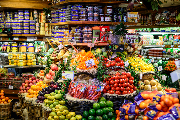
Most of us believe ourselves to be unmoved by the subtle psychological cues in the packaging of the things we buy, choosing products solely based on their merit and value.

Yet product packaging can have a profound effect on even the most practically-minded consumers, including those who enter a retailer with a fixed list and no plans to deviate from it. The truth is, packaging can trigger impulse buying, and it does so by stimulating specific brain regions where logic has limited traction in the face of appealing and enticing objects.
Likewise, unattractive packaging triggers brain regions associated with negative emotions, while “neutral” packaging affects regions of the brain responsible for reflective consideration. Attractive, unattractive, or indifferent, food packaging design affects people’s decision-making while they’re shopping. And one of the primary elements of packaging design is its color—an element that packs more of an emotional punch than many of us realize.
We Learn to Associate Certain Colors with Certain Brands
Brands subtly (or not-so-subtly) condition us to associate certain colors with them. The iconic “Tiffany blue” requires no labeling for us to associate it with that jewelry brand, for example. Food brands get in on this too, as you may experience when you see Starbucks’ dark green branding scheme and associate it with coffee.
Likewise, general color associations play a role in consumer behavior, with red promoting feelings of excitement and energy in most Westerners, while black and silver convey elegance and luxury. Food packaging designs typically include pictures of the product in use, but that doesn’t mean brands don’t use color in other packaging elements (like background or text colors) to attempt to pique consumer curiosity.
Color Can Elevate and Set Apart Food Packaging Designs
If you’re old enough, you may remember a time when so-called store brands were associated with flatly unexciting packaging. You knew it was less expensive than the name brand by its simple packaging. It’s no longer like that in many places, however.

Color and design can turn “budget store brands” into exclusive “private label brands.”
“Store brands” are now “private label” products, and rather than being encased in the plainest of food packaging designs, they’re likely to be packaged in carefully designed packages, many of which make use of cues that convey luxury, such as a black, minimalist design. As another example, every can of peas has a picture of peas on the label, but the brand Le Sueur elevates itself above the crowd with sleek, simple, black and silver labeling. And they’re able to charge more too, compared to other brands.
Sticking to the Script Not Required, However
One of the greatest things about food packaging design is that it continually evolves, including the iconic brands with colors that will forever be associated with them. The rich, dark red of the Dr. Pepper soda packaging tends to remain the same, even if other packaging elements, like shape and typography change. But brands aren’t required to stick to a script with their food packaging designs. As retailers have learned with their “private label” experiments, people may develop a strong, positive response to products that they used to be neutral or negative about.
Low-calorie sweetener Sweet’N Low chose its iconic pink packaging, not because of food-based psychological associations, but so the product would stand out in sugar bowls. In other words, people’s brand-color associations are subject to change, so brands don’t have to feel tied to certain colors in their food packaging designs.
We may think ourselves “above” the kind of brand manipulation we imagine is being used on us when we shop for food, but be assured: food brands choose their packaging designs with great care, and they choose the colors in those designs with great care too. Color, attraction, and mood, are inextricably linked, and when the colors in your food packaging designs are chosen with people’s psychological tendencies and cultural influences in mind, they can have a measurable effect on product sales. PKG Brand Design is always on the forefront of new CPG branding and packaging initiatives; please subscribe to our blog for the latest package design industry news!


